Zendesk Baseline
A refresh and refinement of the Zendesk brand guildelines.
Role:
Senior Brand Designer
Senior Brand Designer
In-House:
Zendesk
Zendesk
I was part of a small team tasked with bringing more consistency to the Zendesk brand language, and scalability as we continued to grow both internal teams and partnerships with external agencies.
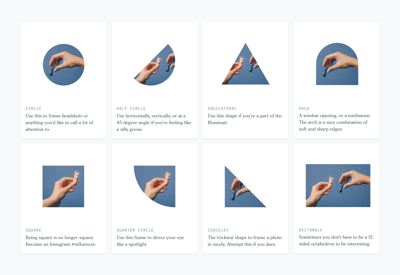
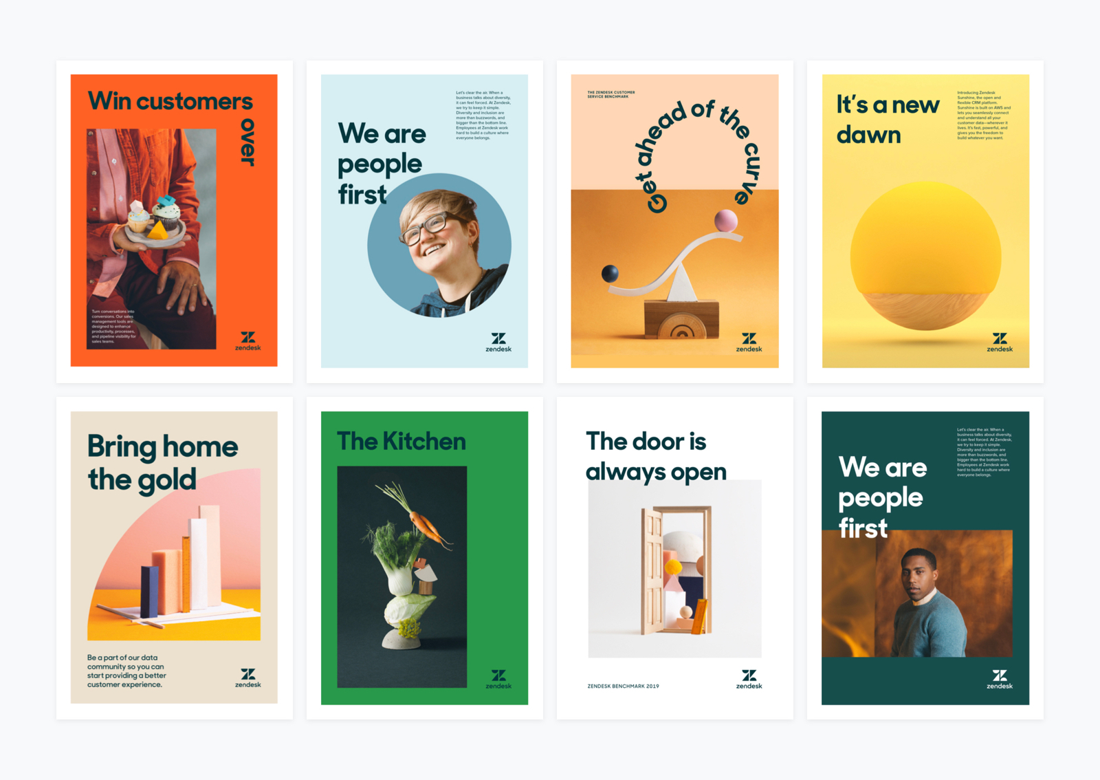
Shapes are at the heart of the Zendesk brand, representing people and personalities in each of our product logos. We wanted to translate shapes to the wider brand language – as a framing device for photography – adding a new shape to our shape palette, alongside refreshed usage guidelines.
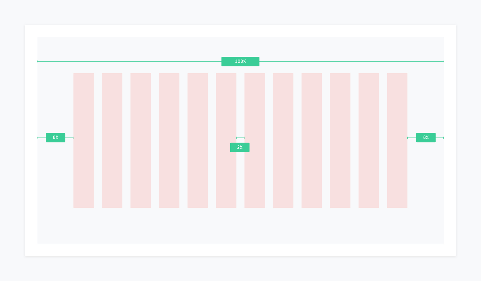
We created a new standardised grid and template system for designers to pick up and work from a consistent baseline every time. The grid is there for support, not restraint, with do’s and don’ts for creating simple yet unexpected layouts, layering guidelines, and suggested logo positioning.

The Baseline team also refreshed of the brand colour palette, creating more inentionality behind the tonal groups. As part of part of the rollout, we ran sessions with the whole team to stress test the system, and start to build out more assets and templates in each brand discipline.
Find the guidelines at:
brandland.zendesk.com
Creative Leads: Sam Bathe, Nick Levesque, Claire Moore
Producer: Emily Mueller
Sam Bathe, Creative Director & Interactive Designer